Product detail pages: Convincing thanks to a well-founded database

We have already written it elsewhere: You need good, better yet, very good product data in order to develop, build and operate a convincing product detail page.
If the customer has found your website, reached the details page via the search or via an overview page, then you have to convince him of the quality and the price of the product here. No amount of tactics will help either. The data on the product detail page must be comprehensive, complete and valid. If a customer buys and there are incorrect, incorrect data on the product detail page, the return is threatened. Even if the customer has to pay the shipping costs here, your profit is gone – not only for this sale, but also for some more. With correct product data you ensure a reduction of your returns! Develop great product detail pages with the help of product data and images, sales documents, videos, etc. This will create the basis for gross income that is good for your business.
Effective headings for product detail pages
Surely you have already heard that headings are important for SEO. Yes, that's right. Therefore, you should think carefully about what the headline for a product looks like on the product detail page. At this point – even if it is the website of the company you work for – you have the full creative power, but the headline will have to look a little different than, for example, at Amazon, Otto or online shops that specialize in your product class. An example: With Amazon, you should always put your brand before the product name.
So you work best with the following structure:
Brand - product name - generic product class – most important product feature - second most important feature...
You can simply omit the brand on your website. Of course, you should mention the product name. While you can already maneuver a little at a foreign online store. An example of this would be that you choose the generic product class for the SKUs of a model differently to find out what will generate more conversions. Does the technical term "ceiling lamp" or the more colloquial "ceiling lamp" bring more? - On Amazon, you could also put both in the headline. Style is not mandatory on the platform of the Internet giant. On your own website, the form is all the more important. In addition, the creative agency has integrated headings in small capitals – capital letters – into the concept of the detail page, then the challenge becomes even greater: capital letters can not be read so well due to the lack of upper and lower lengths of the lowercase letters. You therefore have less space and have to adapt to the style of the industry and that of your house.
Unfortunately, this is not enough either. Even in–house abbreviations – and maybe these are also "industry-standard" - have not lost anything in product names. Probably, they just slipped into the designation, because the ERP system provides for a maximum of 25 or 30 characters. This is often unusable for the end customer. Just write wall lamp instead of WL and the product will be found. What do we mean by this: Use a PIM system, a software for product information management such as Akeneo, to derive the heading appropriately for the respective product detail page.
If you run a shop or have a lot of products in your assortment, it makes sense to have them evaluated by customers. Under the heading is the place to communicate these customer reviews.
So that we don't forget it: The benefits of your company for customers still belong to the product headline. This can be fast delivery, climate neutrality, best service, great delivery capability, German engineering performance, etc. It should be the three to four most important points.
The price should also be placed near the headline – large enough and on the right side of the screen. You should also provide space for discount promotions, strike prices, vouchers and the like.
Model information - easily accessible
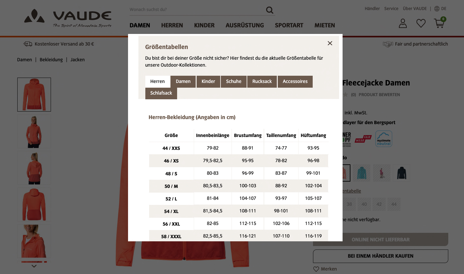
Time and again we notice that manufacturers provide product information in a "flat" table. So there are a lot of individual products that are not related in terms of data technology. On the product detail page, however, these must be related! When it comes to clothing, you want to choose the size, know which ones are in stock and maybe also choose a different color. For clothing, there should be no color icons – thumbnails of the product photos give potential buyers a much better impression of the product. Use a DAM - a digital asset management - and the generation of the thumbnail works practically by itself. There you can also store a size chart for shoes and clothing. This should also be placed in the size selection area. The more secure the customers can order, the fewer returns will come to you and this ensures higher gross yields.
In the vicinity of the model information, the benefits of the model should be named or those of the model series – these can also be, for example, certificate logos or awards. Sometimes there are also prescribed markings, such as the energy consumption class.
Then comes the sufficiently large, clearly visible Order button . Before that, attention should be drawn to the delivery time and the cost of delivery as well as return. In addition, references to payment options – especially with Paypal and Amazon Pay – work wonders: The customer is then immediately aware that he only has a short, uncomplicated check-out process ahead of him.
Photos, photos, photos and maybe even videos
So far, we have only dealt with the headline on product-specific text. This is correct in terms of relevance, because the headline is actually the most important text content, because first of all, customers want to know very clearly whether they have found the right product. Then you want to see how the product looks like. For this, the requirements of the clientele have increased significantly in recent years. At first, a simple photo was enough. Now for many product classes some to many photos are common – front views, back views, those from the side or from above, detail pictures, ambience photos or action shots and dimensional drawings etc. In the meantime, 360 degree rotation objects were en Vogue. Somehow, however, they have a hard time: the production is not really easy, there is no real standard for playing and using these objects, and the usage figures are also not really intoxicating. A larger number of detail photos are more helpful for customers in most cases. Recently, there are also videos that are placed here in some markets.
For clothing, the fit can be better clarified in this way. For technical products, the operation and installation. Depending on the concept, the generation causes even more effort than with the 360 degree spins, but the benefit for the customers is much higher. In turn, a suitable DAM system is helpful for storing and distributing all these files – a digital asset management.
The product description - show what your PIM gives!
Now we come to an area whose position is often discussed. Do we first want to provide further arguments for the product of the detail page and convince the customer – or are we not sure about our products and immediately show what other customers have viewed, similar products, cross- and upsell? We believe that you should test the right position here. Does it work better for you and your customers if you first show the product details and then show alternatives and additional products or is it better the other way around?
We understand a few different elements under the product description: at first it is often a text in which the most important properties of the product – including its advantages – are explained. Sometimes this area is also illustrated. However, manufacturers usually have to provide online retailers with a long text. He can also find his place at this point. In addition, you should place product attributes relevant to the customer including their values here. It's usually something like the technical data of your products. You should make sure that attributes are also summarized in units that make sense for customers. So, for example, no color1 and color2 should be communicated, but color: value1 /value2. So you can build a nice table that is clear for your customers and good for SEO.
In addition to these technical data, there are other contents that should be placed in this area. Most often this is called "downloads". Behind this are construction /operation/maintenance instructions, disposal instructions, certificates, tender texts, BIM objects, drivers and other software products etc. At this point, the brochure or the catalog, which is available for the product series, is usually forgotten. This is the right place, although of course it can also be shown in a general download or catalog area. If these files are then hidden in a tab and not directly visible, this is not really optimal, because the customers can not really imagine what can be found in the area. A different label as a download or a more detailed description are helpful.
Of course, if you allow product reviews, you should also publish them. This would be the right place.